“Email A/B Testing Strategy: Blending Creativity and Analytics to Boost Engagement”
- Pukar Koirala
- Oct 6, 2025
- 2 min read


✨ Introduction
Email marketing remains one of the most powerful digital channels—but success depends on how effectively you communicate your message.
In this project, I set out to explore how content tone, structure, and design choices shape engagement. My goal was to uncover whether creativity or clarity drives better results—and how the right balance between the two can transform reader behavior.
🎯 Objective
The experiment tested two distinct versions of a marketing email to understand how writing style and design impact engagement.
Version A → Formal, text-heavy, single CTA at the bottom
Version B → Conversational tone, visual structure, mid-body CTA
The goal: determine which approach generates higher open and click-through rates while keeping unsubscribes low.

🧩 Process & Methodology
Defined the hypothesis — that conversational tone and visual design would increase engagement.
Created both versions in Canva with consistent branding, fonts, and palette.
Distributed emails via Mailchimp, ensuring equal audience segmentation.
Monitored performance metrics including open rate, CTR, read time, and unsubscribe rate.
Analyzed behavior patterns and qualitative feedback to identify what captured attention.
📨 Version A – The Control
Subject Line → “Explore This Week’s Marketing Highlights”
Tone → Professional and structured
Design → Minimalist layout with concise blocks of text
CTA → Placed at the end of the email
Purpose: Deliver concise information in a professional format suitable for B2B communication.
📨 Version B – The Variation
Subject Line → “Ready to Discover What’s Trending in Marketing?”
Tone → Friendly, conversational, curiosity-driven
Design → Visual elements, icons, short paragraphs, and color accents
CTA → Placed mid-body for higher visibility
Purpose: Inspire engagement by blending storytelling and design to create an approachable, easy-to-scan experience.
📊 Results & Insights
Metric | Version A | Version B | Change |
Open Rate | 18 % | 25 % | + 7 % |
Click-Through Rate (CTR) | 4.5 % | 6.2 % | + 1.7 % |
Read Time (Avg.) | 21 sec | 29 sec | + 8 sec |
Unsubscribe Rate | 1.1 % | 0.8 % | ↓ 0.3 % |
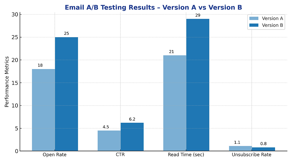
Interpretation:Version B consistently outperformed Version A. Its conversational tone and early CTA created a smoother reading experience, while visuals encouraged longer attention spans.
⚖️ Strengths & Weaknesses
Aspect | Version A | Version B |
Tone | Professional and clear | Friendly and engaging |
Design | Simple, text-focused | Visual-rich and interactive |
CTA | End of email | Mid-body |
Best Use | Corporate or B2B audience | Creative or B2C campaigns |
💡 Key Learnings
The tone of writing directly shapes emotional response and engagement.
Design hierarchy guides how readers consume information.
Strategic CTA placement improves conversion before attention fades.
Combining data analytics with creative storytelling leads to actionable insights.
Continuous testing is essential—each audience reacts differently.
🚀 Conclusion
This project reinforced that effective marketing lies at the intersection of creativity and data. Version B’s performance proved that well-structured storytelling, engaging visuals, and clear CTAs can significantly enhance communication results. These learnings now guide how I plan, design, and optimize campaigns—transforming every email into a measurable story of impact.
🧰 Tools Used
Mailchimp – Distribution & Analytics Canva / Figma – Email Layout Design Power BI / Excel – Data Visualization Grammarly & Hemingway – Tone RefinementNotion – Documentation & Tracking


Comments